You don’t need to be a web designer to build a great site. Here are our tips for how to make a professional website on a shoestring budget.

Starting your own online business can be tricky when your bank account makes you want to cry. You may be wondering how to make a professional website without the funds. New business owners are often stuck between a rock and a hard place. You have to spend money to make money, but how much and how often must you spend money to have a professional website?
Services like social media schedulers, email marketing, and web hosting can be pretty affordable and, if you know where to look, even free! And your audience can’t tell how much you’re paying for them anyway.
When it comes to web design on a budget, many people decide to take the DIY route. There are, after all, many free and easy-to-use tools online. However, more often than not, the result is not good enough to portray professionalism, trust or to provide their audience with the best user experience possible. Even if web tools are free, you need to know how to use them.
Jump to:
- How do you design a professional website?
- Using the right platform
- Marie Kondo your web design
- Use clear, direct CTAs
- Draft a clean menu
- Use typographic hierarchy
- Use color thoughtfully
- Write copy in short sections
- Using images effectively
- Include educational content
- Optimize for mobile viewers
How do you design a professional website?
Simply throwing some pretty images and text together is not enough to create a great website. It’s more complicated than you think. That’s why people are hired to build them. But don’t get me wrong; I’m all about doing it yourself! In fact, I truly believe anyone can learn how to make a professional website if they have the right tools and basic knowledge of what works best both visually and functionally.
So, whether you’re in the process of creating your own site or looking to update your current one, these are things you should keep in mind to make your DIY design look mighty fine.
1. Using the right platform
When you’re not a web designer, the best way to approach building a professional website is to find a user-friendly platform that allows you to customize everything you need without code.
Lots of people vouch for WordPress, but I prefer website builders that are even more simplistic like Squarespace. There are a handful of these platforms that make website building easy and fun, like a video game. Here are a few:
- Wix
- Squarespace
- GoDaddy
- Jimdo
What to look for in a website builder
I won’t get into the differences between all of the platforms here, but in general, comprehensive website builders that include domain hosting are simple, user-friendly, and offer great templates. You won’t be overwhelmed with plugins, backups, and updates. Squarespace, for example, is a great website builder for beginners and anyone looking for a hassle-free solution. Plus, you’ll still be able to get your weekly iced latte thanks to their affordable hosting plans. Web design becomes easy with the correct tools!
2. Marie Kondo your web design
Read: unclutter your website. One of the main things that separate a cheap-seeming website design from a high-quality one is the appropriate use of white space. White space, or negative space, doesn’t refer to the color of the background (it doesn’t have to be white), it refers to the breathing room between the elements of a page. A rule of thumb is that you should be able to easily rest your eyes between elements and differentiate sections without problems.
Less clutter is more (but not less information)
When it comes to designing your site, always remember that less is more. One way to assess if you have too much on a page is to identify necessary information. How many elements (images, text, graphics) absolutely need to be on a given page? Write those down and remove all the others. And yes, that picture of your cat on your about page is totally necessary on your “About Me” page.
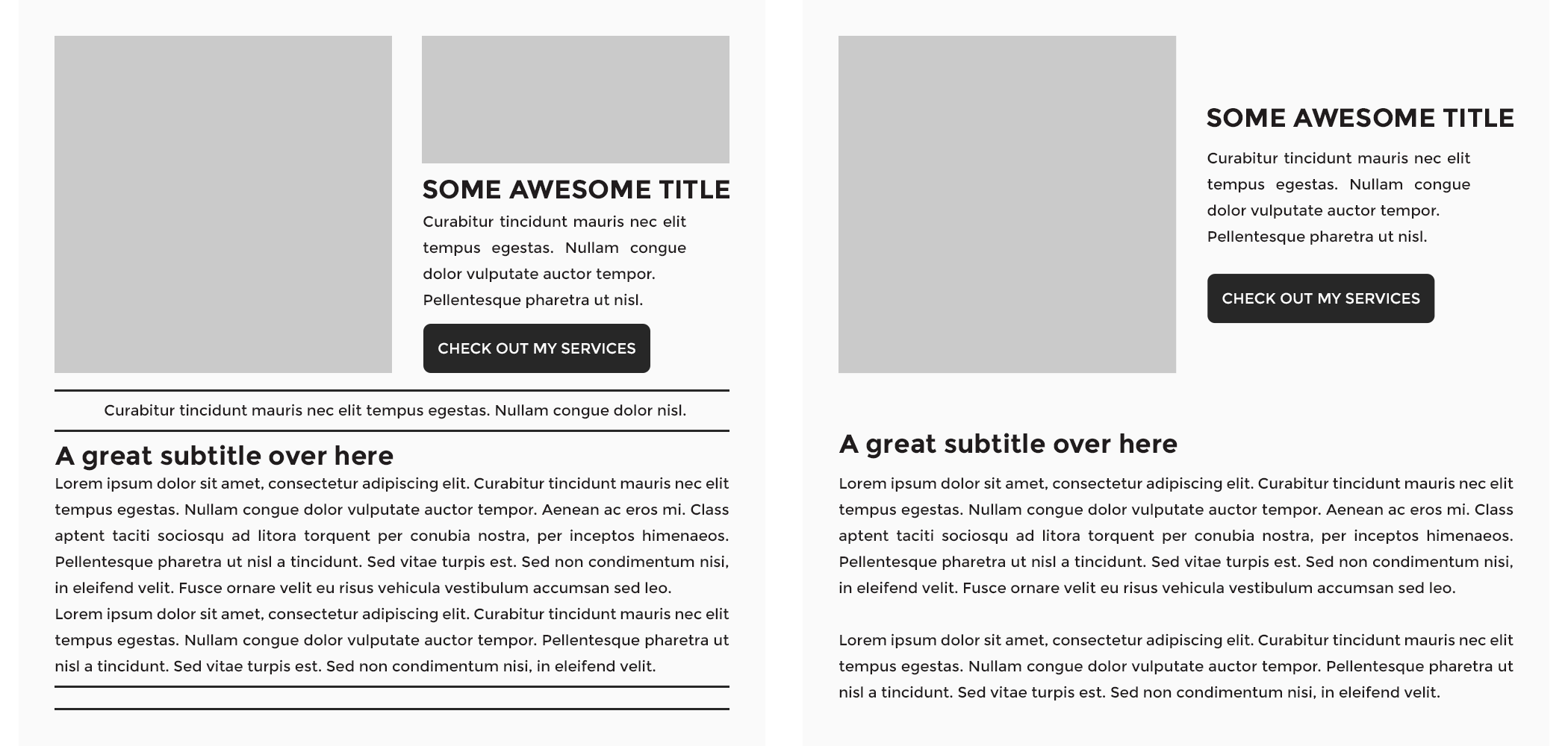
Between these two layouts, the left one represents a page where all the information is crammed and, even when it’s readable, it can easily overwhelm the viewer. On the contrary, the right side has a lot more breathing room. It’s easier to read and looks much more professional because you can tell that all the elements in it have a purpose.
3. Use clear, direct CTAs
CTA stands for “call to action,” and it refers to any action you want your viewers to take when reading a page on your site. In general, every page should have a primary CTA pointing your readers to where you want them to go. Whether the CTA points to a file download, a newsletter sign-up, or a related blog post there should be at least one CTA on every single page.
Think about it this way, anyone entering your website for the first time is looking for information on your services or a resource. You need to guide them and show them where they can contact you, or download or read the resource, without being overwhelmed.
Why the emphasis on “clear”? Because any option you give your audience should be a no-brainer. You want to lay out a clear path for your audience so they find what they need immediately, and you collect their information as a prospect.
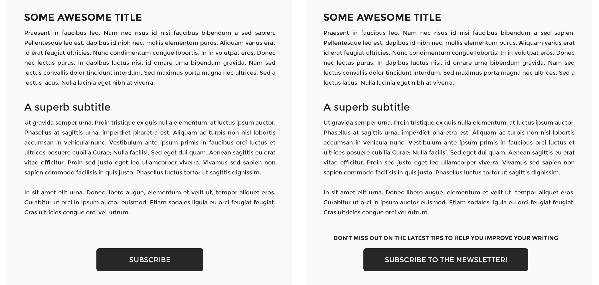
If you want your viewers to sign up for your newsletter, don’t just place a button saying “Subscribe” under your blog post or page content. Instead change the caption to “Subscribe to my newsletter” so people know what they’ll be subscribing to, and add a short phrase near the button explaining what they’ll get by doing it, something like: “Sign up for tips and tricks to help you improve your writing.”
4. Draft a clean menu
Just like you don’t want to overwhelm your readers with a cluttered design or too many CTAs, you don’t want to do it with your menu items either. The menu on your header or in your hamburger dropdown should point to relevant pages, but it doesn’t have to include all of them. Be sure to nest subcategories appropriately. Here’s one way a menu can be nested:
- Home
- Services
- Copyediting
- Copywriting
- Resources
- Blog
- E-Books
- FAQ
- Contact
- About Me
If you have too many links, it’s best to consolidate them into nested categories. In some cases, the broader the category the better.
Don’t forget to have a search function on your website—just in case people are struggling to find an older blog article. You can achieve this by having a search bar either on your sidebar (if you have one), on your header, or on the footer section.
What about the site footer?
Your website footer is a great place for your copyright notice, a link to your privacy policy, a sitemap, contact link, social media icons, and a CTA directing visitors to sign up for your newsletter. A central logo is typical as well. The font in your footer should be colored more lightly than your header. Visitors will scroll to your footer if they can’t find something in the header, which ideally, they can. It’s best to address frequently accessed links in the header.
Pro tip
Contact forms are so important for an optimal clientflow. With HoneyBook, you can pull clients directly into your clientflow and trigger an automated response in seconds. Never lose a client to a competitor again!
5. Use typographic hierarchy
There’s nothing worse than wasting time. To make your audience’s experience better, you should organize your page content using a typographic hierarchy. Font or typographic hierarchy is when you use different font sizes to communicate different sections of an article.
When a website visitor skims your content like they are apt to do, they’ll be able to tell what the page is all about and if the information they’re looking for is in there. Hint: it should be!
The appropriate size and font color are key when it comes to differentiating titles and subtitles from your body of content. However, don’t go overboard. Consistently using two to three different-sized headers and one paragraph font should be enough to achieve the organization level you need. Strive to have no more than three different font types on your website.
If applicable, you can also create an emphasized font style for quotes, tweets, or any other additional content that is meant to stand out. Just remember to keep it consistent with your entire website.
6. Use color thoughtfully
There’s a difference between adding your brand colors to your website and adding brand colors to your website in a way that draws people in. The former is what happens when you simply want all your branding visuals to match, while the latter involves a creative strategy.
Download our great first impressions workbook.
Audit your social media, map your process, and create effective contact forms for an efficient discovery phase.
Get my workbook.Choose one color to be your action color. It has to be easily differentiated from the content and the headers, and it should be used for links and buttons all over your site.
The idea is to guide your readers along the page and make it easy for them to know where they should click. It’s not enough that you tell them “Click here”; they need to be visually queued to do so.
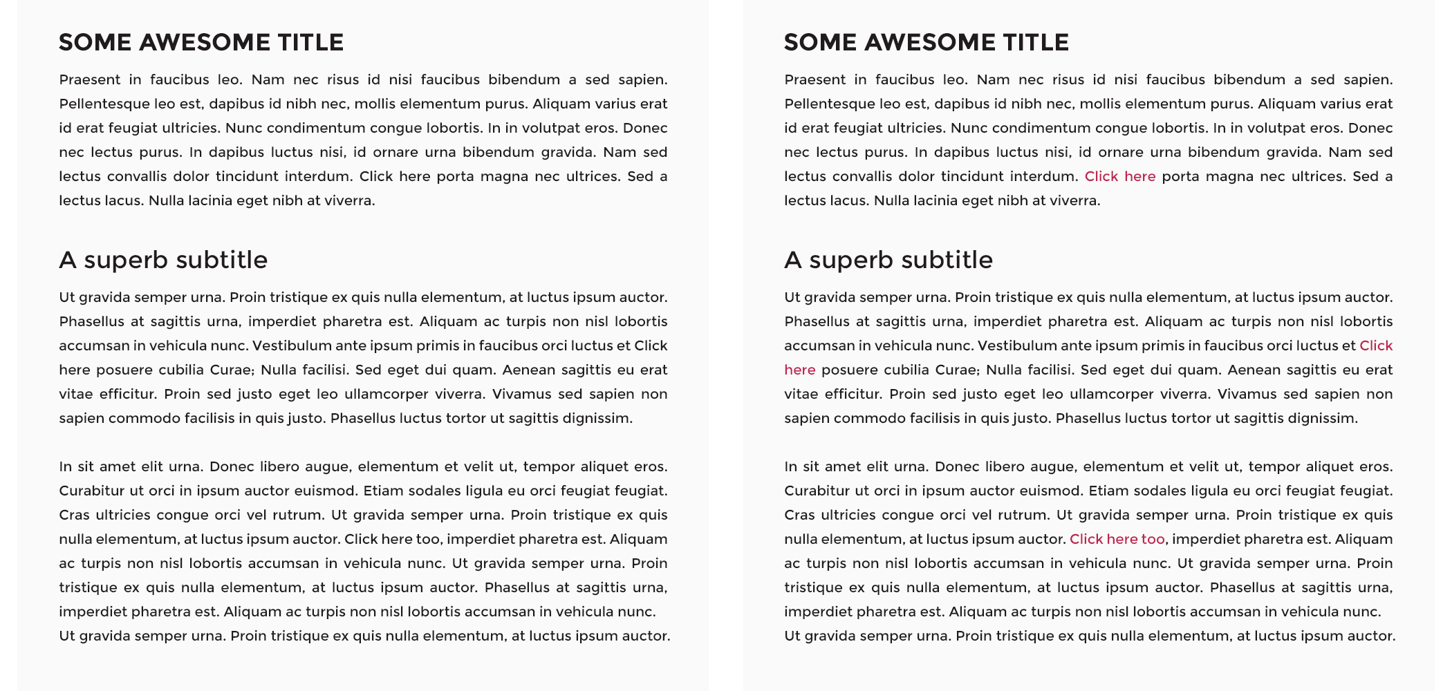
Even when it’s the same text on both sides, there’s a dramatic difference between the left, where you don’t have an anchor link color, and the right, where you do. The color catches your eye, and that’s why you want to be strategic about where you incorporate it. The more sparingly you use it on your page, the more attention-grabbing it will be when you do.
7. Write copy in short sections
It’s pretty simple: if you want your viewers to read your content, you need to make it approachable. Period. Big chunks of text without spacing, titles, subtitles, or bullet points are a huge no-no. If you’re concerned about your copywriting capabilities, never fear: AI is here. Free tools like Grammarly can help you write web copy error-free.
Your homepage
Your homepage and contact page are the best for short sections with clear information. Don’t bother with large unnecessary blocks on your homepage. Save your business story for the “About Me” page. The homepage is meant to give your readers an overview of what your site is about and what you offer, and direct them to the information they need to contact you about your services. That’s it.
Your about me page
Your about me page is written to help your website visitors connect with you and your mission. That said, the about me page can handle a bit more text. An optimal length for an about me page is about 300 words, broken up into easy-to-read chunks of text. Include a photo of yourself that shows your clients who you are—who they can look forward to working with.
Your services page
Make your service descriptions straightforward. I recommend approaching this in the following way:
- Think about everything your clients need to know about your services
- Reflect on what questions you’re asked by clients most frequently about your services
- Combine these two results for a cohesive service description
To help you get rid of too much text, you can use the same principle as with the uncluttered design: leave only what’s absolutely necessary and delete the rest.
Your blog
Your blog should be the most content-rich portion of your website. Aim for posts that are relevant to your services and industry that are between 1,000 and 1,800 words long. The short section advice holds true here as well; break up chunks of text into organized short paragraphs and intersperse CTAs. Keep your audience engaged, but not overwhelmed.
8. Using images effectively
With free stock photo sites out there like Unsplash, it’s pretty difficult to have lousy imagery on your site. It’s one thing, however, to have high-quality images on your site, and another entirely to use imagery that encourages prospects to use your services.
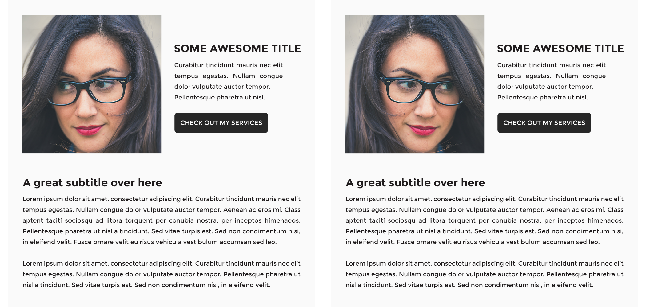
And, if you’re using pictures with people’s faces in them, keep in mind that the viewer naturally tends to look at what others are looking at—because apparently, we’re nosy like that. If your image has someone looking to the right, try to place that picture in a way that the person “looks” at your content.
Here you can see how even when both layouts look perfectly fine, the one on the right makes you look at the content the person in the image is “seeing” more naturally than when she’s looking away.
9. Include educational content
Both new visitors to your site and repeated readers of your content clicked your URL for a reason. Make it easy on them! Build out SEO for blog posts so they have a chance of ranking on Google. Be sure they all have metadata, like a title and meta description. Use free keyword analysis tools to be sure enticing, oft-referenced keywords are bringing readers to your site.
Arrange your blog posts with thumbnails so it’s easy to find interesting content organically.
10. Optimize for mobile viewers
All websites nowadays must be considered responsive, or mobile-friendly. Having a responsive website means that your content will be optimally displayed on any device. Luckily, many website builders have responsiveness built in and allow you to preview your site on mobile. However, even when the theme you might be working with calls itself responsive, it may not be altering part of your content that could look better if displayed differently.
If your website builder doesn’t have a mobile preview (unlikely!) there’s a workaround. A quick way to find out how your website looks on different devices is to open your URL on Google Chrome, click at the top menu View > Developer > Developer Tools, and then click on the small devices icon located just below the frame of the pop-up window (don’t close the pop-up!).
Next, you can select from the top dropdown menu, where it says “Responsive,” the device or screen size you’d like to see your site in, and browse around to have an idea of how your visitors might be seeing your pages.
A couple of things you can look out for are:
- Text alignment
- Button alignment
- Elements that overflow outside the frame
- Spacing between sections
If you find any issues with your elements, try moving things around to make them look better, and add or remove spacing.
Maximize your website with a clientflow platform
Once you have a beautiful website, it’s time to make sure it functions how you want it to. Make sure you’re engaging your website visitors to take an action, whether it’s using your contact forms to become a lead or schedule with you directly to become a client.
With HoneyBook, you can embed contact forms that funnel visitors directly into your pipeline, where automation can nurture them and turn them into clients.
Funnel website visitors into your clientflow
Make it easy to turn website visitors into paying clients. Try HoneyBook free to capture, qualify, and convert leads.

