Typography is one of the most integral aspects of design, and it can be difficult running a small business without a basic understanding. While you’ll probably hire a designer for big projects like rebranding, there are plenty of other situations from designing infographics to print materials where a working knowledge of typography is helpful.
We’re excited to present a series of posts over the next few weeks about typography. We will be covering types of fonts, uses, the basics of styling, and more! Today we begin with types of fonts and their uses.
Types of Fonts and Their Uses
Serif
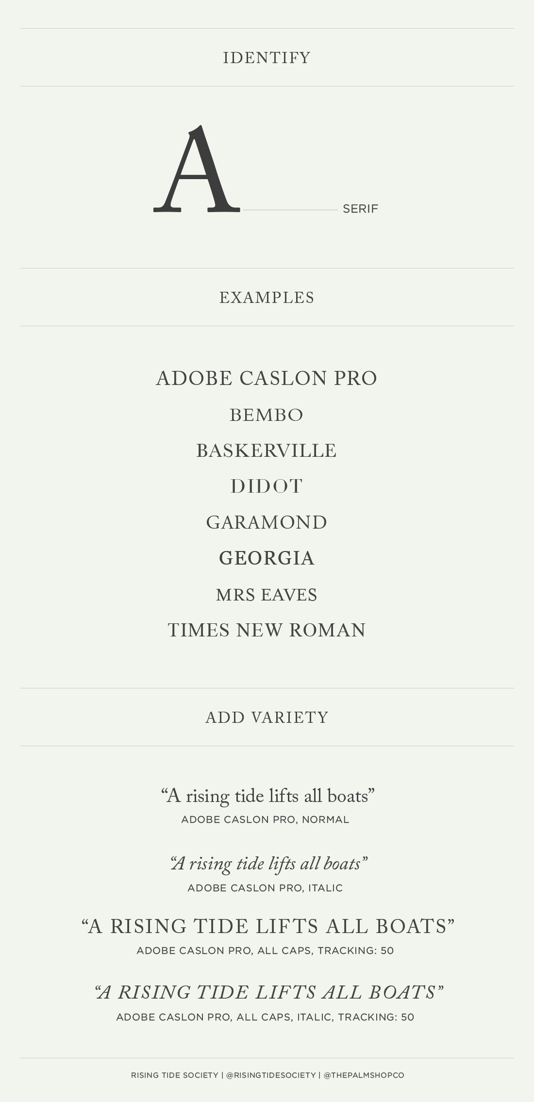
Serif fonts are my favorite. They’re classic, easy to read, and look good just about anywhere. You can tell a font is a serif if it has little “feet” on the edges of a letter. Serifs work great for logos, body copy, titles and printed materials. You can add a lot of variety to a serif font by playing with italics, all caps, and letter spacing.
Sans Serif
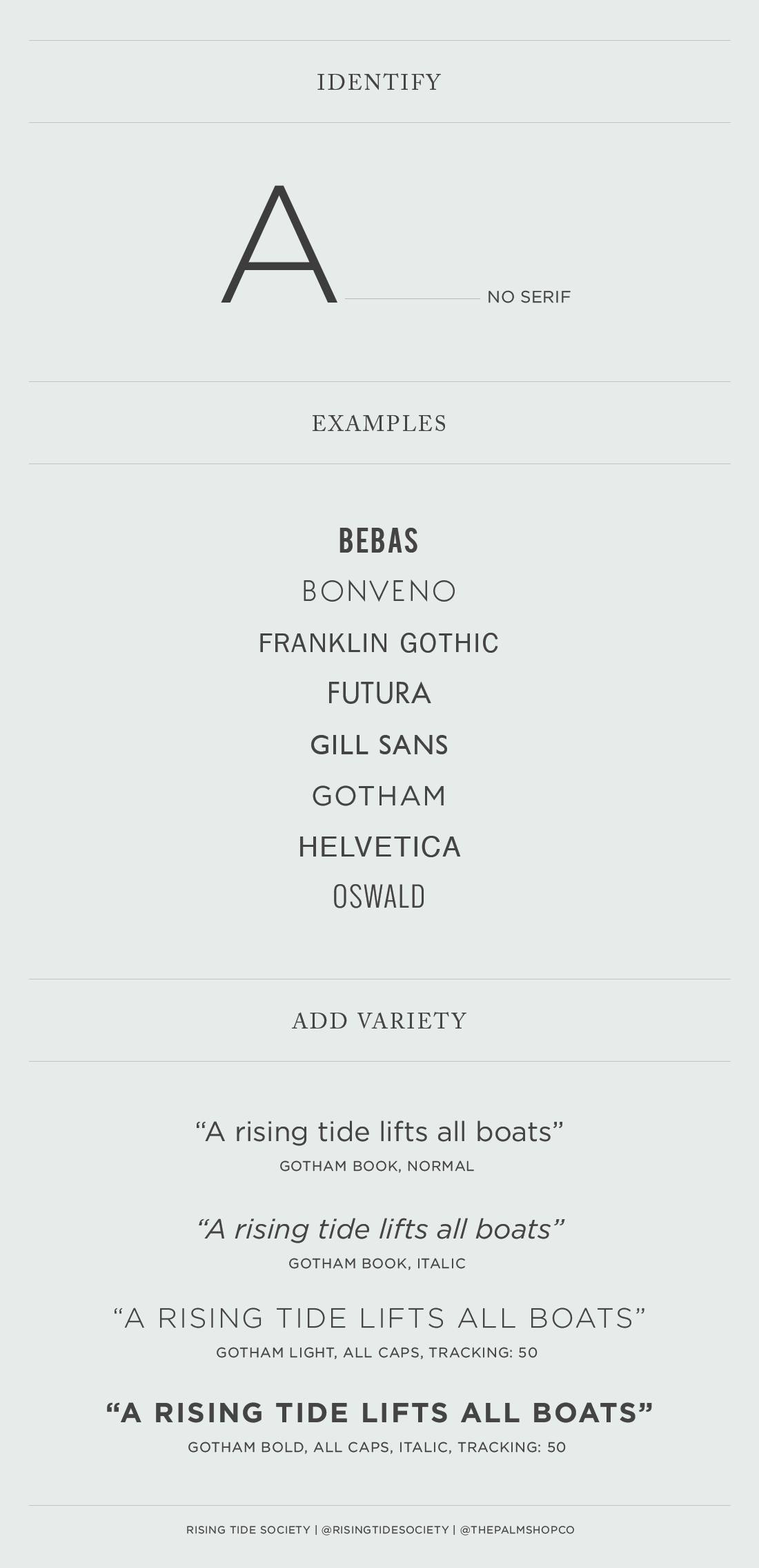
Sans serifs lack the little “feet” that serifs have. They’re considered more contemporary and have a more casual feel. They work great for headlines because they’re very legible–street signs use sans serif fonts. In many instances, sans serifs look better on screens because they are less detailed.
Slab Serif
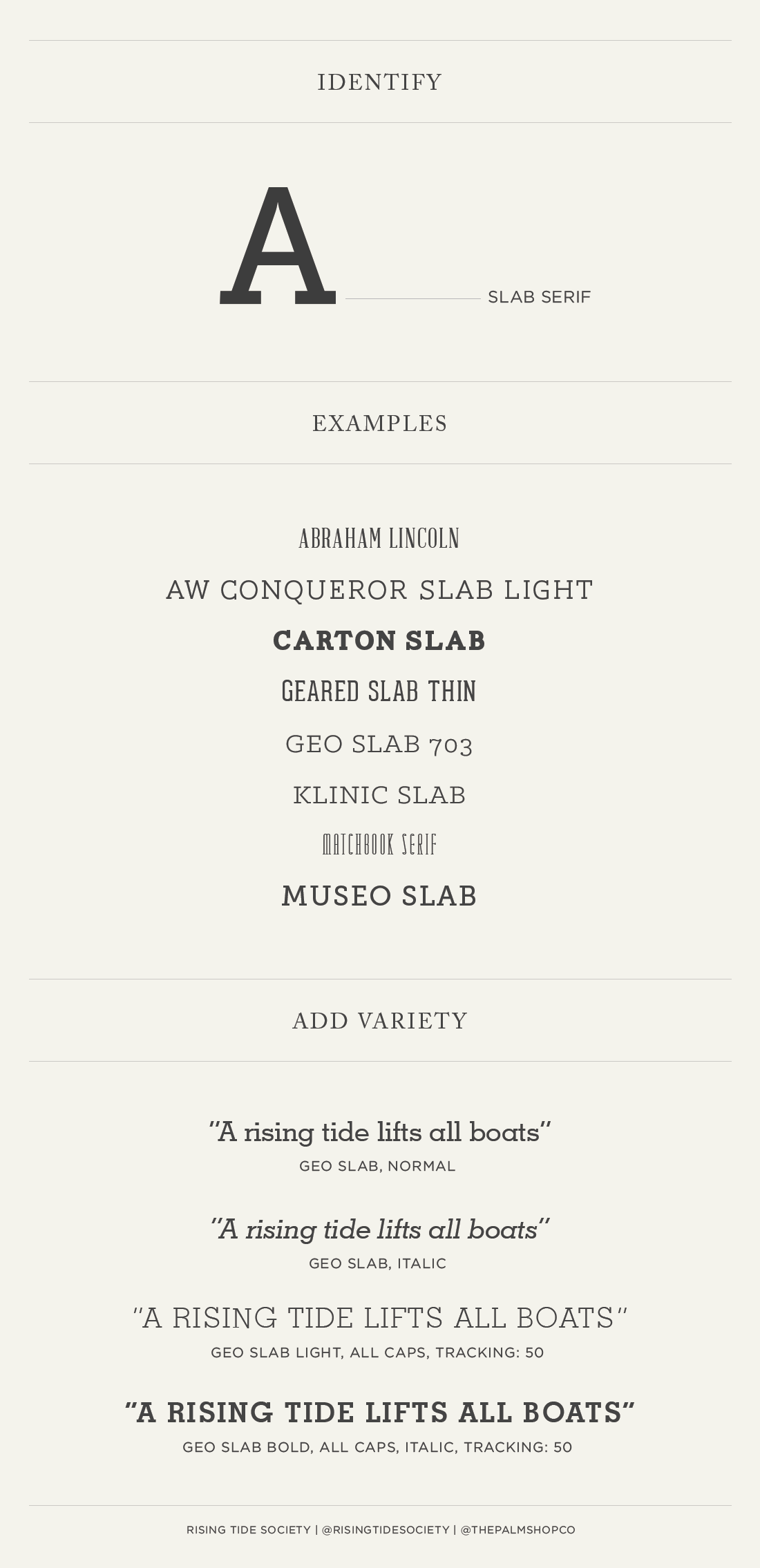
A few years ago slab serifs were really “in” and you could find one in almost everything I designed. Slab serifs are best used sparingly. They’re more difficult to read than serif or sans serif, and they’re a little more decorative.
Scripts
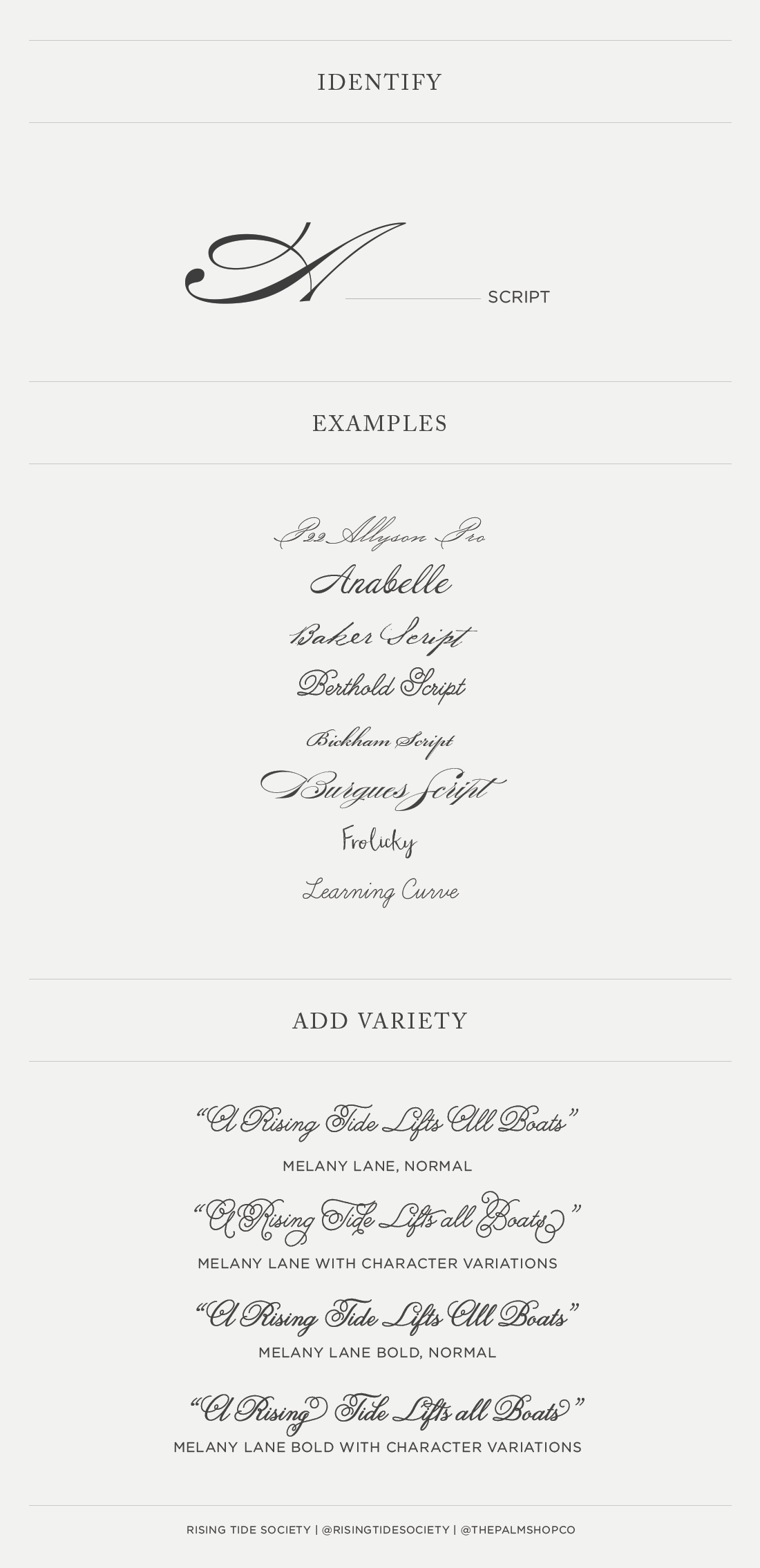
Scripts are super popular in the wedding world. They look great for logos, headlines and accents. Scripts are difficult to read after a few lines and even though they’re pretty, you should be careful not to overuse them. Calligraphy often uses a script. If you’ve purchased a nice script font, make sure you open up the glyphs tool in Photoshop or Illustrator. Nicer scripts often have character variations that help tie elements together and make a word feel more finished. When you’re working with a good script, it’s often best to work word-by-word to ensure characters come together perfectly. Less is always more with scripts – especially if it’s calligraphic.
Monospaced
I rarely use monospaced fonts because I think they’re not very pretty. They were created for typewriters and are used online to distinguish HTML and code. Unless you’re working on something with a typewriter feel, you can ignore these fonts entirely. Please. 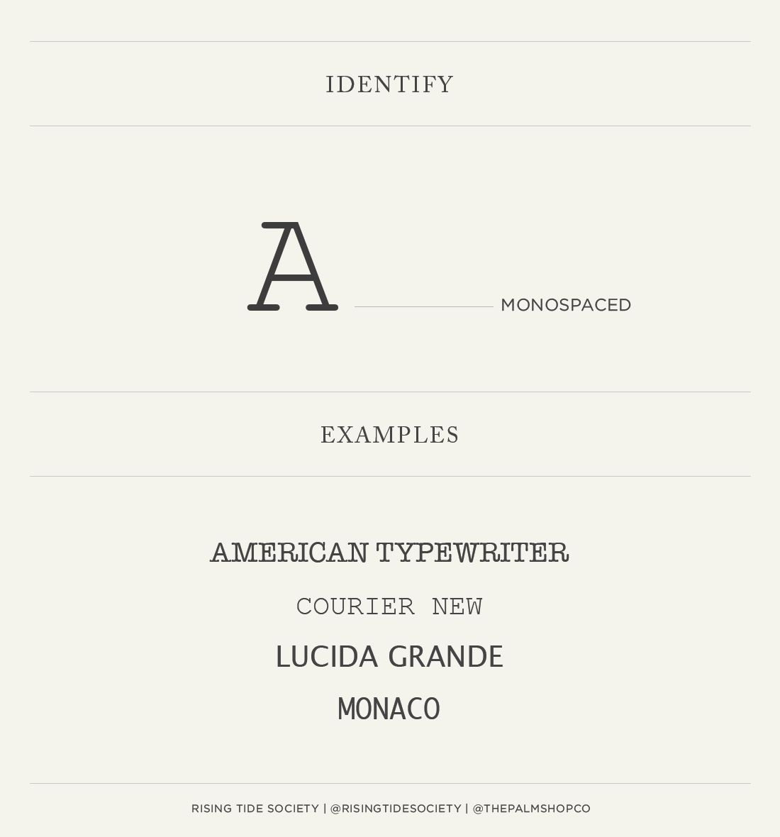
Display Fonts
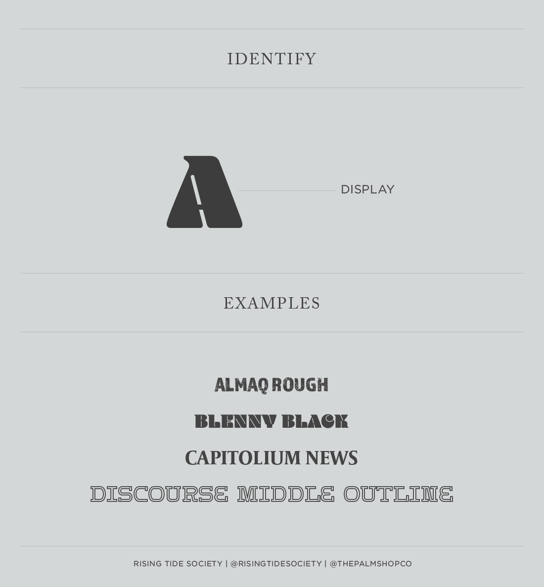
Specialty fonts, fonts that mimic handwriting, outlines, and anything that doesn’t fit in one of the above categories is generally considered a display or decorative font. These fonts should use used very sparingly, and only with one or two other serif or sans serif fonts at the very most. They’re best for headlines and decorative type. Never, ever use display fonts for body copy. 